Site navigation issues

I thought I was nagivating logically through the course, then at the end checked my progress and found several missed lessons, which also explained why some of the tests and quizzes asked about things not apparently covered in the course. Getting back to the missed lessons was difficult (I didn't just want to take the quiz).
This happened for two reasons.
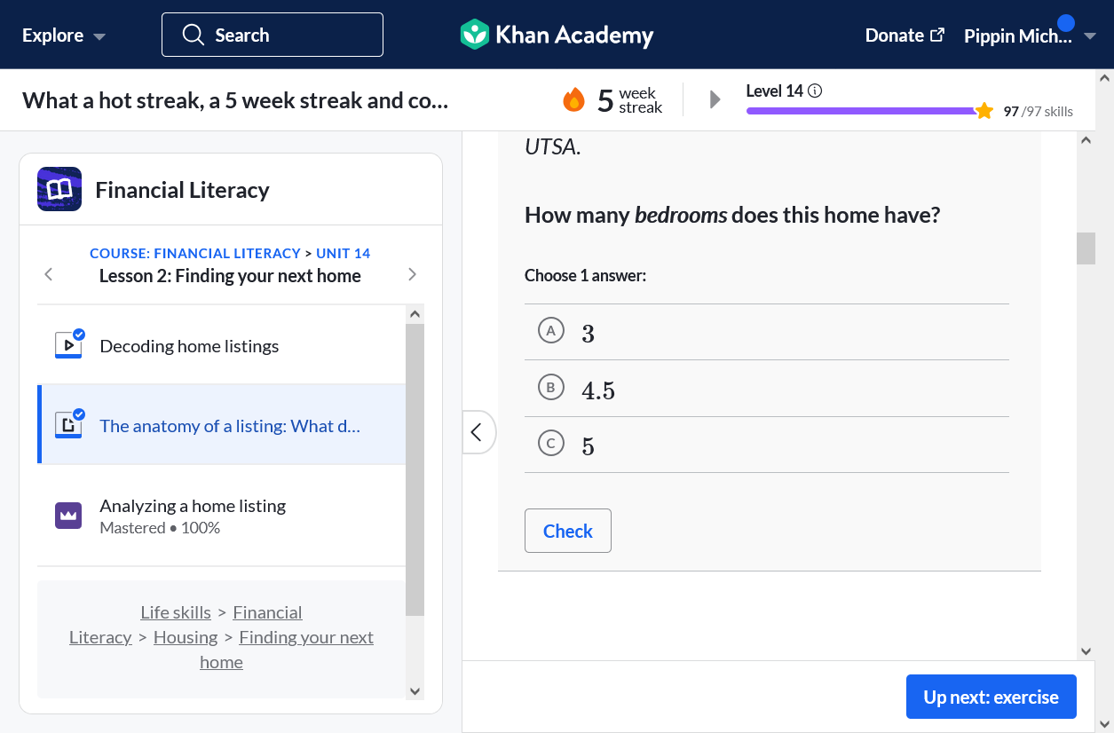
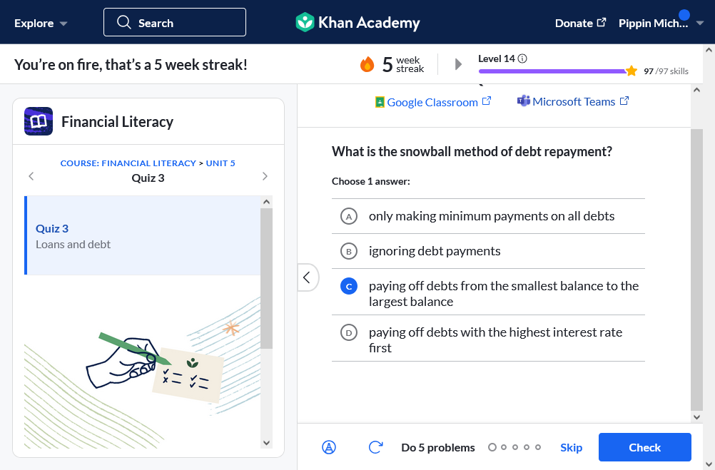
1. Check button moves around
For many practices, quizzes and tests, the check button is at the bottom right, and is blue with white text. Then suddenly it is at the bottom left and is blue text only (sometimes with a rounded rectangle outline round it). At the same time, the forward button, which is blue, is where the check button usually is. It took several units before I understood to look out for this, and even then it caused me confusion.
2. End of page is not clearly demarcated
So, I take a practice quiz, and you have (appropriately) created a blank space after it, However, because the design is seamless and white, I often think I've got to the bottom of the page when I have not. Then I erroneously click the forward button and cannot understand why nothing makes sense any more.
So, my suggestion(s) is/are:
1. keep the check button bottom left and make it a separate color
2. create an "end of page/lesson/unit" marker at the end of the page
These would help so much!
PS - I tried to submit this through the "feature request" page but it would not let me submit. I attached a screenshot, but I can't do that here.

U moet u aanmelden om een opmerking te plaatsen.