UI Proposal: Boosting Learner Motivation with At-A-Glance Progress Visuals

Hello Khan Academy Team,
I would like to propose a small UI improvement that could significantly boost learner motivation.
Currently, the "Unit Mastery" percentage on course pages is displayed only as text (e.g., "71%"). It would be very impactful if the unit card background itself could act as a subtle progress bar—filling up from left to right based on the user's mastery percentage.
Why this helps:
-
Instant Visual Feedback: Learners can see their progress across multiple units at a glance without reading specific numbers.
-
Gamification: Watching the box fill up with color provides a stronger sense of completion and satisfaction than a static text number.
A simple implementation could use a linear-gradient background on the unit container (e.g., linear-gradient(90deg, [Color] 71%, transparent 71%)). This would make the interface feel more dynamic and responsive to student efforts.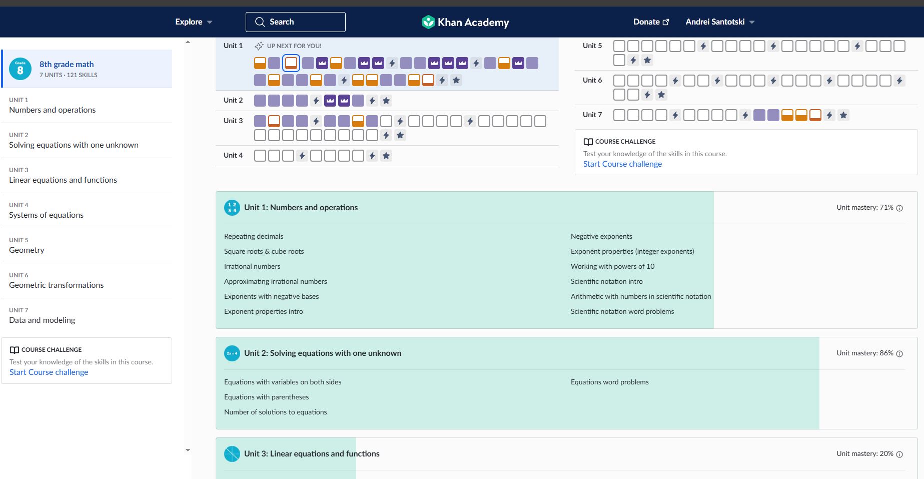
Thank you for all the work you do!

Iniciar sesión para dejar un comentario.